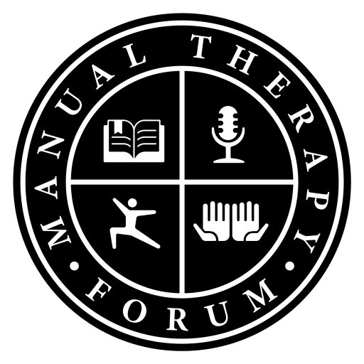
I’ve been working on a few things recently, and one of them has been a new logo! This comes from a talented graphic designer named Paul Alvarez (thanks Paul!). With the change of the website name, I wanted to come up with a different logo too. This was a concept that I came up with and Paul came up with the rest. As you will see, there are four particular quadrants within the logo. I’m sure you all can figure out what they mean or stand for, but I’ll talk about it anyway 🙂
- The top left shows an open book to symbolize book knowledge (something we should all strive to continue improving on) and keeping an “open” mind to new things.
- The top right shows a microphone. One, to symbolize letting your voice be heard (this is a forum after all). Two, a way to indicate the podcast we have.
- The bottom left is a human figure. I was originally going for a symbol like the Vitruvian man, but like this one better because it looks more athletic. This is to indicate that we are to work with the person we are treating as a whole, and not just individual parts.
- The bottom right depicts two hands to remind everyone the importance of what we do with our hands to help those we are working with.
So there you have it. I’m super stoked about this logo, and hope that you all appreciate it too! Cheers to new things!

Love the logo!
LikeLiked by 1 person
Thanks Randy!
LikeLike
Great logo matt! Very inspirational.
Sent from my iPhone
>
LikeLiked by 1 person
Thanks Jeff!
LikeLike